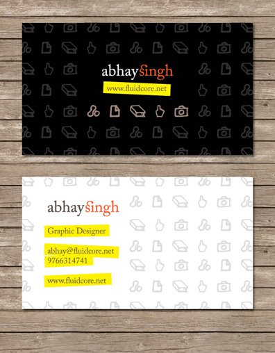
Need feedback on my new business cards

Deathdart

Disciple
I'm working on this new business card design for myself. :) I really need some constructive criticism and feedback on this, as these cards have to last me quite some time once they're printed. :p I'll be sending these off to my printer in a few days, so am trying to finalize the design asap.

This is front + back BTW

So... please critique! :)

Have a look at a large version at this link -- Abhay Singh Card Concept 1 by =Deathdart on deviantART
 

Attachments

  • BusinessCardsPreview.jpg
    BusinessCardsPreview.jpg
    76.6 KB · Views: 172
The design is really nice but the yellow on white doesn't read well enough it should be bolder and easier to see. :) I think I the text is getting lost as the card may be a tad busy looking too.
 
Yellow doesn't read well on white, meaning? There's no yellow text on white so there's no question of readability. Perhaps you mean the brown text on the yellow BG? I'm a little confused about that, not sure whether I'll go with the brown, or a 100k black or a rich black. The brown looks more appealing to me, though a black would be more readable. What do you think? :)
 
@R3D-D3V1L -- thanks for the feedback :) I have tried that, but I feel the highlights give the card a unique personality. I haven't seen anything similar done on business cards; have you? I'd like the design to be as memorable as possible. This card will be handed out more to other designers than to potential clients.

If you have any particular arguments against the yellow highlight, please do let me know so that I can look into it. :)
 
The yellow stands out too much against the text, as for the BG its too symmetrical, something a little more asymmetrical should do it. Try to add a few dull colors to the images in the BG? maybe that might help. Moreover try to add a little vector art in the bg.. maybe a few lines here and there.. Blocks should make the difference too.

:)
 
@SoMxNemesis: The colors will become much duller when this is printed, especially so because of matte coating, so the yellow won't be quite so bright. :) All the colors look much brighter on a monitor. BTW, the whole thing is vector :p I wouldn't risk losing quality printing from a raster file.

And no, I will not be adding random lines and blocks in the BG.
 
No offense :) please. More than one comment has mentioned that the yellow doesn't read well....I have been in the Graphics biz for a long time, I have an Art degree and I am a Freelance Designer myself, so I can tell you 100% that the #1 thing that a business card needs is readability. ;) I am sorry because I like your design but your card just doesn't read clearly enough.

I think the design really has potential, but you need to polish it and work on it a bit more and :) make it easier to read. Perhaps using a different font might make the card pop a little more too.
 
ah maybe you forgot one thing - here cards are mostly printed using age old screen printing tech. digital is way too costly here so you will have to remove the black from the front of your card.

also i see you have used more than three colours. do one thing - convert all colours into cmyk format and then see if the printer will give you a digital test copy of just one card for both front and back.
 
^^ a really good point :) I had no idea about this since we easily have access to cheap digital printing here. If you are working in Illustrator or Photoshop, I think you can simulate the colors in CMYK by changing the view settings.
 
@Party Monger: Thanks! This is going to cost me around Rs. 1.4 per card for 500 cards. :)

@PiXeLpUsHeR: I'm not offended. I seriously didn't understand what you meant at first. :p And I still don't get what you mean by "Yellow doesn't read well", as there is absolutely no text in yellow to be read. :| I agree on the point that it still needs to be polished, that's why I'm getting feedback from people right now. ;)

@6pack and PiXeLpUsHeR: I am a 4th year Graphic Design student.... I am in no way a n00b at printing, I have studied printing techniques and get a LOT of stuff printed for projects. So it goes without saying that I wouldn't ever use a huge black patch or so many colors if I was going for screen printing. Neither will I use digital printing for a large quantity because it is expensive and doesn't always give satisfactory print quality.

I'm getting this printed from an offset press. These guys, thankfully, print quantities as low as 250 cards on an offset machine, so I'm getting 500 cards from them (250 cards cost almost the same amount as 500!!!!!). They print on 300GSM stock and I'm getting the cards matte coated as well so that adds a bit to the weight. Overall the stock is quite stiff and I'm happy with it for the price I'm getting it at. to put this into perspective, 300gsm stock will cost me only Rs. 700-something for 500 cards, where as the really stiff 400GSM which I originally wanted costs a whopping 4-5k for a small quantity like mine.

I do work with proof and overprint preview on with the correct paper and coating settings, but that still doesn't give an accurate enough preview. What I'm using to judge colors instead is a number of sample prints from earlier jobs that the printer has sent me. I have to get a test print from a digital printer today, lets see how that goes. :)
 
IMHO Simplest is Best. E.g. My personal cards have just my name and no. in the center, with a border at the card periphery. Address & email is at the back. Always gets me the response I require :D
 
@axeman: I agree, simplicity always works well for me too... :) That's why I've kept this card quite simple. Not minimal though - I see too many minimalistic cards used by designers these days, so I did this to stand out from the crowd a bit :D
 
[mod]This thread has been reported as surrogate advertising by several users. I am still not closing it but if there are any such threads in the future then they will be merged with this one.

Please report any similar threads so that they can be merged with this one.

PP please take note as this section is going to be your baby from tomorrow onwards. :)[/mod]

Deathdart said:
Yellow doesn't read well on white, meaning? There's no yellow text on white so there's no question of readability. Perhaps you mean the brown text on the yellow BG? I'm a little confused about that, not sure whether I'll go with the brown, or a 100k black or a rich black. The brown looks more appealing to me, though a black would be more readable. What do you think? :)

Yes either decrease the saturation on yellow or use a darker shade of brown. Preferably both. Right now the contrast between the background and the text color is not good enough.
 
How is this advertising?

All graphic design related queries or links go here. Share your wallpapers, skins, themes and photographic skills too!

All I asked for is feedback on my work. I believe that's a "graphic design related query" and not advertising. It's like saying that if a photographer puts up his photos on the eye-candy forum for feedback, he's just looking for clients by showing off his work. I'm really disappointed with and offended by the previous post.

---

About the yellow, I believe it will become duller when printed. I have to get test prints before deciding whether it needs any adjustments. I might switch to rich black text on the yellow bg, but I can't be sure till the test prints are done.
 
Deathdart said:
How is this advertising?
.
To clarify, because you have your business card with your work number and website address which was commercial in nature
 
Back
Top